05/11/2020
By utilising in-page surveying, analytics and the evaluation of a number of websites of large UK-based organisations, we’ve updated the design across the Church of England and Archbishops’ websites to incorporate a number of new features to improve navigation:
- A more accessible header design, which uses less space and incorporates more functionality
- A new menu system that better serves the amount of content available
- A more consistent user experience across different devices
We're thrilled that these changes have gone live today. Over the coming months, we'll be adding further updates to enhance the user experience of our online platforms including changes to the search system.
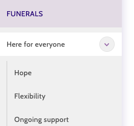
One of the key changes we've made is the ability to browse the structure of the entire website, without leaving the page you are currently on. This means you can locate the right page, before committing to visiting it, giving you more flexibility in browsing. To show how this works, in the Funerals section of the website you can see a section named Here for everyone. You can either click on the page title and visit the Here for everyone page or click on the arrow alongside the page title to access pages within that section of the website.
Desktop
The menu is always present on the left-hand side of the screen. On the home page, we see promoted links and other key pages. Once you select an area of the website to browse through, via the updated top-level navigation, the left-hand menu updates to provide context on where you are located.

Tablet
The same menu is open in landscape mode but collapsed in portrait mode to save space. It functions in the same way as on Desktop and is enhanced for touch.

Mobile
We’ve used a tried and testing method of browsing which keeps the whole menu system in a single element accessible via the burger menu in the top right. It’s slightly different from the Desktop and Tablet browsing experiences but means that more of the screen can be dedicated to content which is important on smaller devices.

There are further updates on the horizon including an improved search experience for website visitors. We continually invest in our online platforms and hope that the updates we're making over the next few months not only make content easier to find and interact with but bring more people into conversations around faith and the Church.
We really welcome your feedback on these improvements and changes. Do get in touch with us through the contact form on the website.
Ben Hollebon
Web and Insights Manager