24/09/2020
It’s important to make a good first impression and, just as if someone were visiting a service or event for the first time, you will want to make them feel welcome. Here are some simple ideas and tips to check that you’re making the most of your website home page.
Let visitors know who you are
People visiting your website for the first, and even the fifth time, will want to understand your church community and what they can expect when they are able to attend a service or event. You don’t have to achieve this just with text. Use photos and video to create a rich experience for people wanting to find out more.
Try using simple text that gives an immediate sense of understanding. For example:
Welcome to St Mary’s church – supporting and transforming our community
or
Thanks for visiting – we’re a community helping people discover their purpose in life.
Structure your page according to ‘Z’
Pages that don’t contain a lot of detailed information prompt eye movement that resembles the letter ‘Z’. You can read more about this research on The Next Web, but the stand out sentence reads “where simplicity is a priority and the call-to-action is the main takeaway,” the ‘Z’ pattern emerges.

Whilst there may be a number of call-to-actions on your home page, you can use visual hierarchy through headings, images and graphics to direct visitors further down your page. Always place your most important call-to-action towards the top of your page and ideally visible or partially visible above the fold. Here’s a quick read on what this term means.
Mobile optimisation is key
You’re most likely designing your website on a desktop or laptop computer, with a screen size 13” or greater in size. Once you’ve spent time making a functional home page that looks great on your home computer, remember to ensure everything looks good on both a tablet and mobile device. If you’re not able to put your hands-on different devices, the web browser Google Chrome has a device simulator that allows you to view an approximation of what your website will look like on different devices. Read more about how to use it on BrowserStack. It’s always a good idea to test on real devices, but this gives you a quick way of checking things as you’re building them.
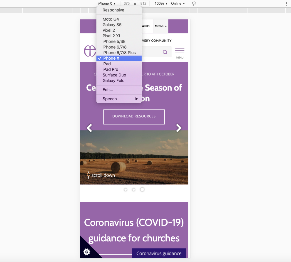
In the second quarter of 2020, mobile devices (excluding tablets) generated 51.53% of global website traffic and so it’s incredibly important that you cater to the mobile visitor.
Ask for feedback and listen to it
Is your page giving the right information to visitors or are people getting confused when they come to your website? The only people who can answer this question are, you've guessed it, visitors! If you're able to integrate a short survey on your website or ask people who have recently started attending your church about their online experience with you, you'll open yourself up to a wealth of first-hand information that will help you improve this vital communication tool. People love to feedback about experiences they've had, the frustrations they've encountered and where they think things could have been done better. If we're able to view this as an opportunity to improve our offering rather than complaints, we allow ourselves to become more effective communicators.
We often run short surveys on the Church of England website that ask basic questions such as:
- How would you rate the Church of England website on ease of use (scale 1-5)
- What was your main reason for visiting the Church of England website (pre-defined list of options)
- What are your biggest frustrations when visiting the Church of England website? (free text)
- What would you like to see improve/change on the Church of England website? (free text)
The ability to provide a path of feedback and then actually engage with those comments is a really valuable tool in improving our online tools and bringing people into our church communities.
Hopefully, these few tips will help you improve the home page on your church website. There's so much more to think about, but it's best to take a couple of things and spend time making sure you've implemented them really well. Remember that this is a journey and that you should be regularly reviewing your content, page layout and website structure to ensure it's up-to-date and relevant.
Ben Hollebon
Web and Insights Manager for the Church of England
Keep up to date with all things digital and join our Labs Latest newsletter.