17/05/2019

Once created, you can use your logo on your website, A Church Near You page, social media sites and on leaflets or flyers.
Here are 10 tips to consider when creating a logo:
1. Know your brand and your audience
This is fundamental when approaching the creativity of your design. You must know what you want to represent and who you are trying to reach.
Be aware of the demographics of your audience, including age, location, interests – the more you know, the better. This will help you decide the style, colours and fonts of your logo.
2. Brainstorm!
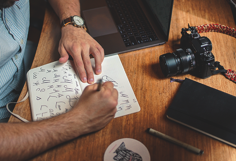
Before starting to design your logo, write and draw lots of ideas on a piece of paper in the form of a brainstorm. Write down as many words as you can, related to who the logo is being created for. Think about objects, related words and concepts.
Remember, there’s no right or wrong, just follow your mind’s flow.
3. Don’t be literal
When creating a logo, it can be tempting to be literal. It’s easy to draw an icon directly related to the name of your church; however, a creative idea could result in a more appealing logo.
For example, if we were creating a logo for an organisation called White Rabbit, you could literally draw a white rabbit. But what about drawing out a specific part of the rabbit? It might be its round tail, cute nose or the print of its paws. This is already a different perspective and could make your logo more appealing and interesting.
Or, you could think about a concept related to the rabbit. For example, when thinking about the characteristics of the rabbit, you might think of jumping and bouncing. Could you use the concept of jumping, instead of the actual animal?
4. Do your research
Research is great for inspiration, but most importantly it helps you to avoid creating something that has already been made.
The internet is a great source of inspiration, but don’t forget bookshops and libraries, where you can find amazing content about design and logos too.
5. Draw it
A good logo often starts with pencil and paper. Don’t throw yourself in front of your computer straight away. Sketch ideas in your notebook with variations of the idea. Work on proportions and change the layout of the elements until you are more or less happy with the design.
6. Digitalise it
Now it’s time to move to a computer and start converting your logo into a digital file.
Traditionally, you would need to use a program like Adobe Illustrator, however, there are now some great free alternative if you do not have access to this, Canva is a great free alternative. Find out how to use Canva here.
Tip: When downloading your file from Canva, choose the .png file format to use on your website and in print.
7. Choose readable fonts
When choosing the fonts, stick to the most readable ones. Your audience needs to be able to read the name in a fraction of a second.
Tip: Never use more than two different fonts in any design to improve readability.
8. Colours
There is a whole philosophy and meaning behind every colour, so choose the colours that best match your core message.
Remember, your logo must work in black and white too, so start here, and then make a second version in colour.
Tip: Download two versions of your logo, for versatility. One in black and white and another with colour.
9. Versatility
Your logo will be used in different ways, both in digital and print, requiring different ratios, so create a variety of layouts: landscape, portrait, squared or text only.
10. Let it breathe!
Give each piece of your logo a specific space and do not squeeze all the elements next to each other. Also, keep a clear space around the logo when it is used in a design so that it stands out.
Finally, create some simple guidelines to give to people who may use your logo, so they know how and when to use it. Have a look at the Church of England’s logo guidelines here.
Mariano Gobbi
Digital content producer
Keep up to date with all things digital and join our Labs Latest newsletter. Subscribe here